Ads even your mother would love
You know what they say, “April showers bring May—day calls for last minute Mother’s Day gifts?”
Mother’s Day is the first major retail event since the onset of the COVID-19 pandemic, and it’s coming up quickly. In another article, we outlined 5 ideas for catering your campaigns to customers’ needs during this time of uncertainty, but even the best campaign ideas can flop if they aren’t brought to life by the right ad creative.
That’s why we took a look back at 2019 and pulled some of our favorite Mother’s Day campaign creatives that delivered in both scale and performance to inspire your campaigns for now and in the future.
The categories we looked at were:
1. Shopping
2. Arts & Entertainment
3. Health & Fitness
Let’s take a closer look at a handful of these ads and the creative best practices that make them ads your mother would even love.

Simple Concept
It’s always better to test several simple creative concepts than one with everything on it.
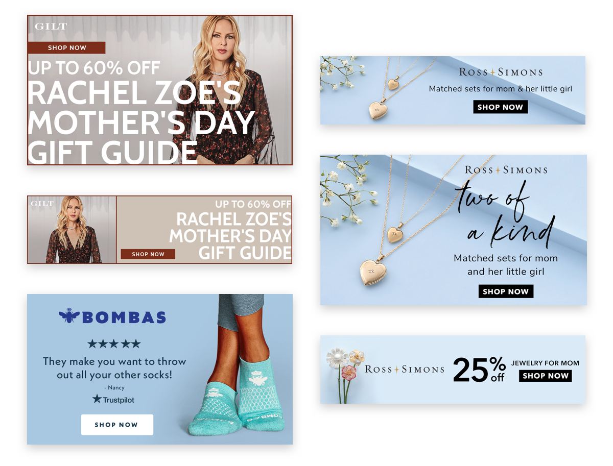
From the clean product photography to the concise line of copy, Ross-Simons kept this creative to the bare essentials. The result is a minimal design that is sure to catch your eye.
Strong Colors
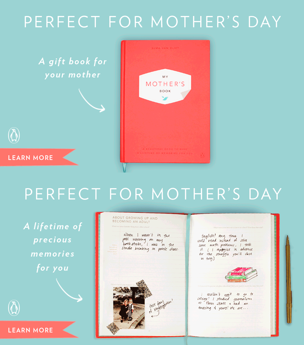
Choose a color palette that establishes your brand, enhances the messaging, and influences behavior.
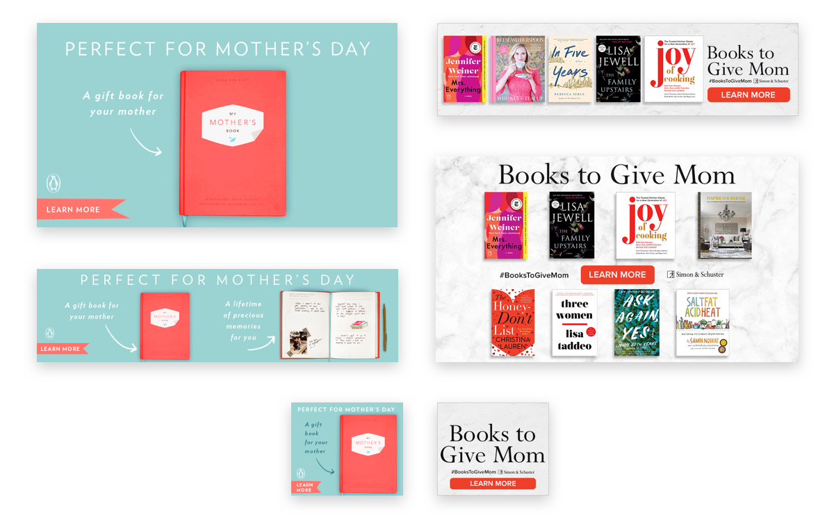
Penguin Random House utilized complementary colors of blue and red to make the product pop and stand out amongst other content. It was also clever to mirror the CTA to the color of the notebook.

Clear Messaging
Keep it short and to the point. It needs to capture attention, demonstrate value, and set expectations.
I don’t think Simon & Schuster could be any more clear than “Books to Give Mom.” The messaging is straight to the point and sets the expectation of shopping for Mom.
Cross Device
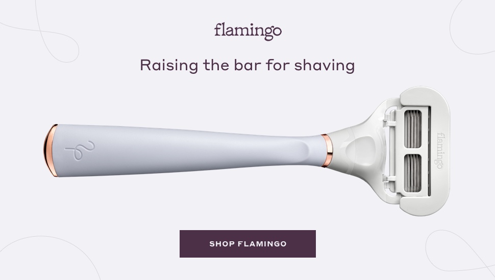
55% of LiveIntent impressions are served on mobile, so optimize your ads for viewing on various devices.
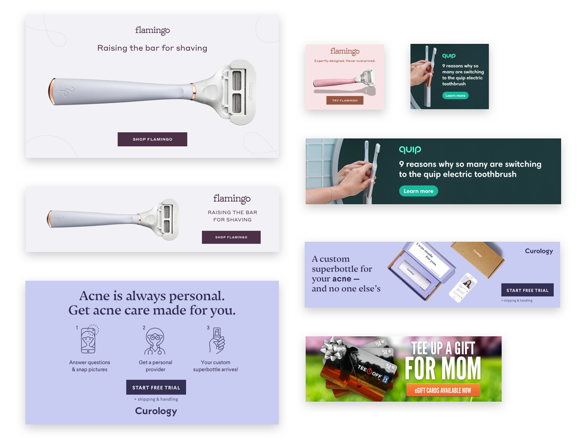
Flamingo used a large product shot paired with minimal designs to create an ad that will render nicely across all devices. Whether it’s on a phone or desktop, this sleek design will stand out.

Keep Branding Visible
Keep your logo visible and complementary to the overall design.
While this best practice may seem like common sense, it often gets overlooked. Bombas does a nice job here of creating a hierarchy between their logo, copy, and CTA. Their logo draws the eye in but does not overpower the other elements.

Straightforward Call-to-Action
Let people know what they’re clicking into so when they land on the page, they’re ready to take action.
Many brands like Quip have seen success using content marketing for a soft-sell on our platform. By using a “Learn More” CTA, the viewers expect to find out more about the 9 reasons on the landing page and will engage with that content. This best practice may also seem like common sense, however, a small tweak of wording could drive results.
If you want to learn more about marketing for Mother’s Day during COVID-19 and want a deep dive into the data we pulled, check out this episode of our Real Time Banter series.
