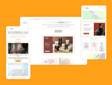
Love is in the A— Ad Slots
Ahhh February is here… which means we’ll soon be sipping wine by candlelight or spilling Pad Thai on our couches while watching You’ve Got Mail… Both are quality time spent with your significant others, but let’s not forget about others that you should hold dear to your heart: potential customers.
Much like with your partner, the way you speak to them is the key to their hearts (and wallets). It can be confusing, frustrating even, to know what they want. Sadly, we can’t read minds… To help inspire you in creating swoon-worthy ads, we rounded up some high-performing ads and outlined why we love them.
Before we get into what we love about these ads, we need to set the mood first. Below are 6 creative best practices that drive performance and are important to keep in mind while reviewing your ads.
1. Simple Concepts
Keep it simple. It’s always better to test several simple concepts than one with everything on it.
2. Strong Colors
Choose a color palette that establishes your brand, enhances the messaging, and influences behavior.
3. Keep Branding Visible
Keep your logo visible and complementary to the overall design.
4. Cross-Device
A vast amount of impressions are served on mobile, so optimize your ads for viewing on various devices.
5. Straightforward Call-to-Action
Let people know what they’re clicking into so they’re ready to take action.
6. Clear Messaging
Keep it to the point. It needs to capture attention, demonstrate value, and set expectations.
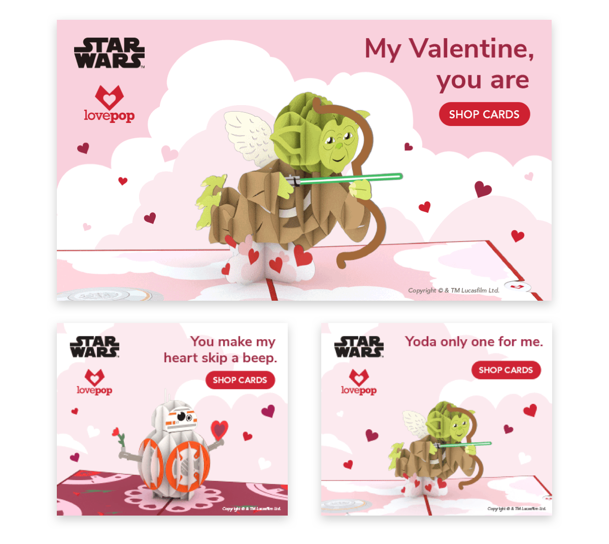
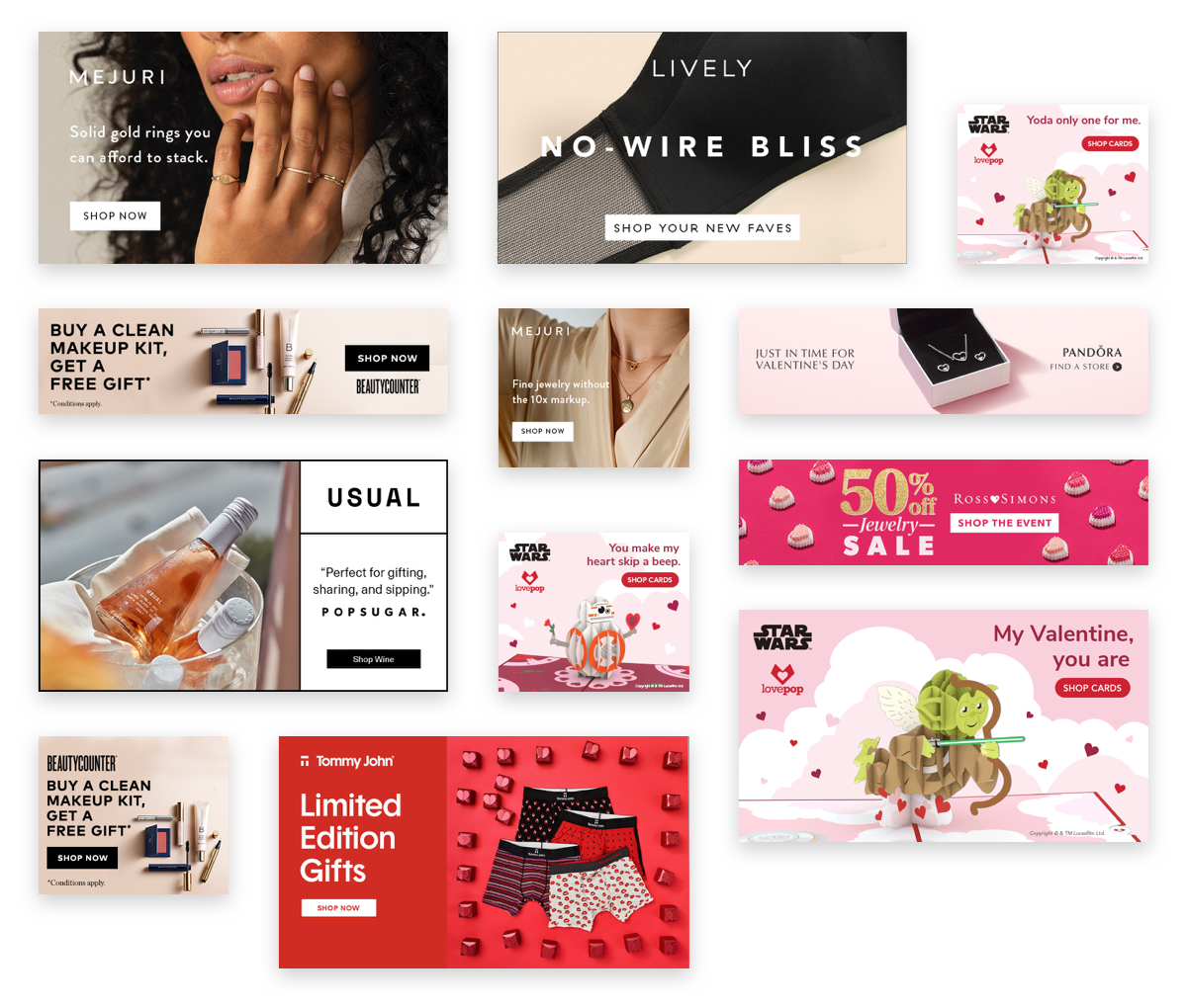
Why we love this creative
Simple Concept – Lovepop used a single product shot in a creative way to drive the design.
Clear Messaging – The copy is clever and makes you chuckle.
Strong Colors – Lovepop utilized Valentine’s Day colors to build on their brand color and enhance the messaging.

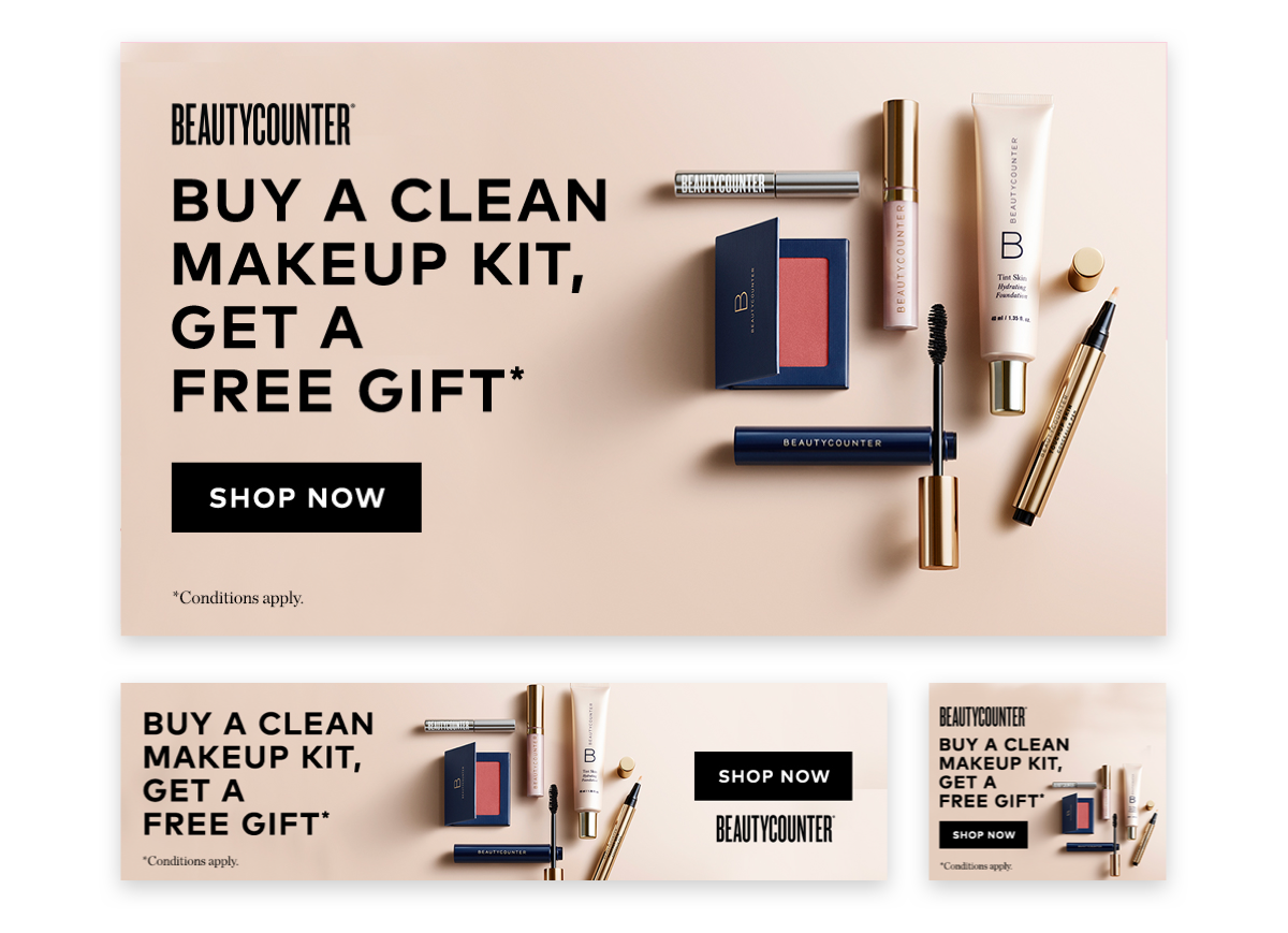
Why we love this creative
Clear Messaging – This is some clean, simple design. It’s just the basics but it’s everything you need to know.
Strong Colors – The strong contrast in the pastel pink and rich blacks makes both the copy and the product stand out.

Why we love this creative
Simple Concept – This is an example of how to effective overlay text on a full-frame image.Also, the shallow depth of field in the photo guides your eyes directly to the rings.
Straightforward Call-to-Action – Mejuri designed their CTA button to be bold and eye-catching without being obnoxious.

Why we love this creative
Strong Colors – Ross Simons chose a magenta that POPS and relates to Valentine’s Day.
Simple Concept – Instead of trying to showcase both the jewelry and the sale, Ross Simons kept it simple and focused on promoting the sale.
Straightforward Call-to-Action – You know you’ll be clicking into a landing page for the sale.

Why we love this creative
Strong Colors – Like Ross Simons (above), Tommy John chose a strong color palette that not only stands out from the background but makes the copy and products pop.
Clear Messaging – The copy is short and sweet (just like this bullet point… well, maybe not anymore after I started trying to make a clever joke in these parentheses).
Why we love this creative
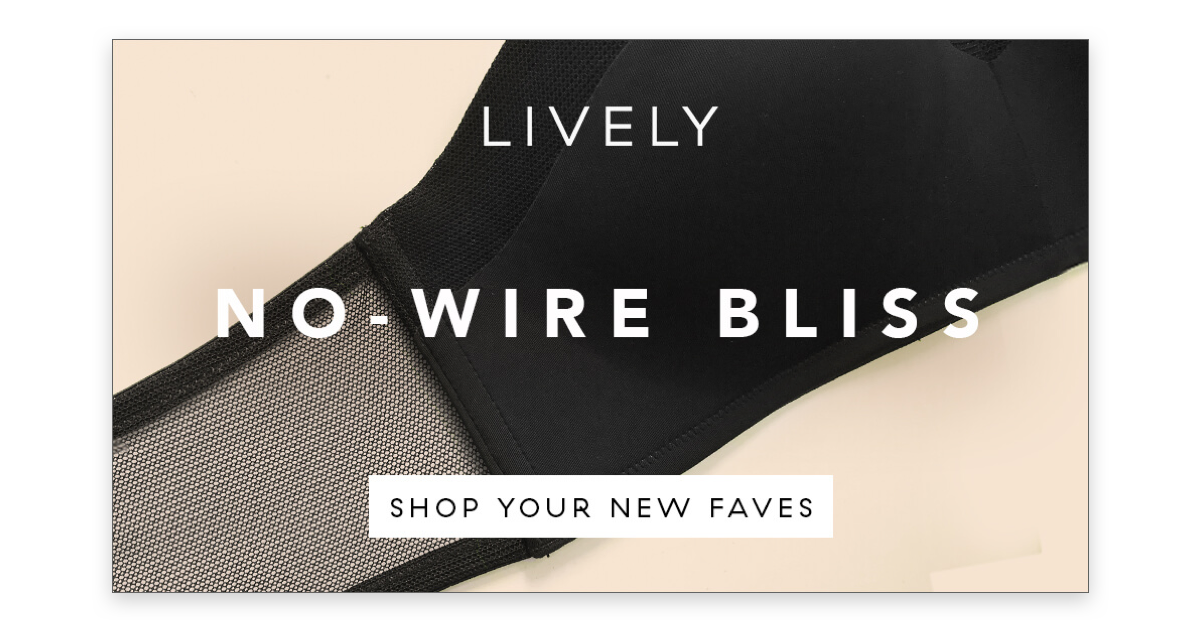
Simple Concept – This is a clever way of incorporating photography into the design to create a graphic background.
Clear Messaging – Smart copy along with the closeup photos get the point across. Lively had no need to show the full product. This is truly a case where less is more.
Why we love this creative
Strong Colors – While the color is muted, it was a strong choice. Paired with the simple design, it communicates elegance, luxury, and beauty.
Clear Messaging – The copy showcases deal clearly and sets expectations.

Why we love this creative
Keep Branding Visible – The contrast in colors makes the logo pop out and the image showcases the matching branding element (gold dot) on the shoes.
Clear Messaging – The sImple copy plays off of the photo with a fun pun.
Cross-Device – The large type will hold up be legible across any device.
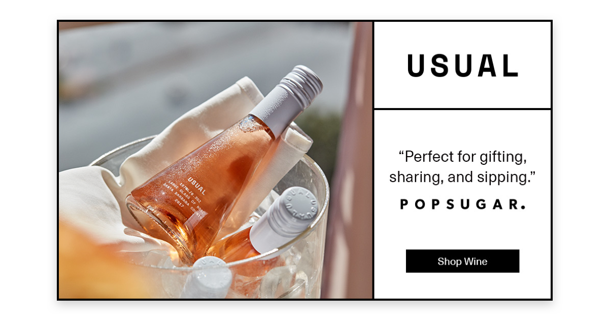
Why we love this creative
Clear Messaging – Not only is the featured review short and sweet, but it pairs nicely with the photo of multiple bottles.
Straightforward Call-to-Action – The button clearly defines what you’ll find on the landing page.
And finally, one last ad from our friends at Lovepop…
Who doesn’t love a baby Yoda moment?
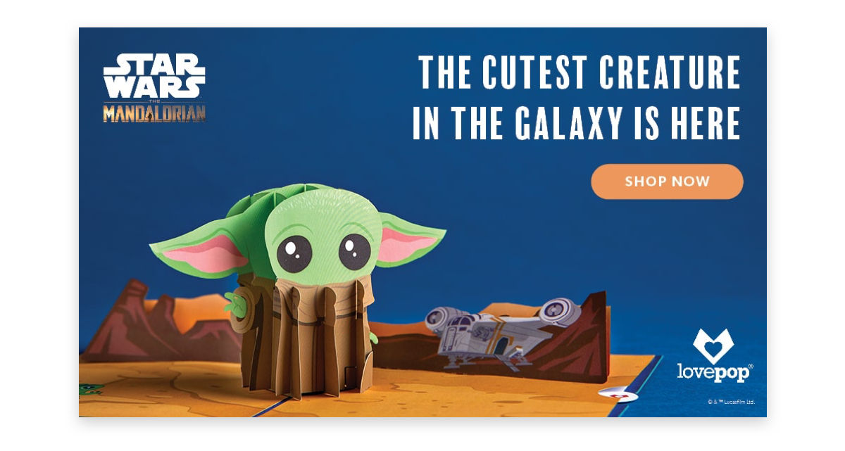
Because nothing can follow Baby Yoda, this list of creatives that we love has to come to an end. We hope these examples inspire you to test a new (simple) concepts and we wish you luck with finding the way to your customers hearts.
—